Each Highland Cow portrait is a one-of-a-kind, unique oil painting. This little video shows the beginning stage of a new painting, which has been commissioned recently. Im going to film the whole process on this one and give the client the video along with the piece.
Paint a dog portrait in oils - how to choose a background colour
Painting a dog or cat portrait and unsure what background colours to use? Here are a few ideas:
Select a colour scheme

'Penny' Oil on panel 30 x 25 cm
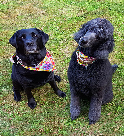
This tiny little Chihuahua was painted using a limited palette of Transparent Maroon, Blue black, Warm White and Radiant Yellow
Before starting on a pet portrait painting decide on a colour scheme and a composition for the new piece. The colour scheme might be a striking one with clashing colours for dramatic effect, or a more gentle blend of similar shades, with soothing harmonious tones. Consider the background and the colours for the dog all at the same time, at the beginning. This helps to create a well planned piece, and ensures that the final goal can be seen right from the start. You definitely don't want to get mid way through painting a portrait and have to start making major decisions about colour.
When the portrait is a commission that I am painting, the client will request a certain colour to be included in the piece, perhaps a duck egg blue background, or lime green tones, and I can use that information when planning the painting.
Painting from photos selectively
I wouldn't always suggest painting from photographs, and I myself rarely use photo references for still life or floral paintings. For pet portraits though, working from photos is necessary for practical reasons. Commissions purchased on the website are often long-distance, international, or may be of dogs that are sadly no longer with us. So reference photos are essential, but they have their limitations.
I don't necessarily try and replicate the very same colours that are present in the photo. They may not translate well into a painting. One of the great things about painting a picture is it gives us the opportunity to move things around, and have things as we like them to be.
For instance in this picture, the dogs are amazing (I'm biased) But I would try and think about whether I want the painting to be green based, just because the photo has grass.
Reference pictures are great as a guide to form and facial expression, capturing the likeness, and as a guide to placement of the pet's markings. The rest of the piece is up to the artist and it mainly comes from inside your head and heart!
Keeping things cohesive.
Start with one base colour and add more layers of colour as the painting progresses. I always paint the subject and the background at the same time, putting any spare brushfuls of 'dog colour' into the background . One reason for this is it helps to make the subject look as if it belongs there. I love portraits where the dog or cat does not look 'lost' in the middle of the canvas. Using a unified colour scheme, and painting the dog and background at the same time helps with this.
The dog is the star!
The background in a dog portrait can be soft and a bit abstract, which has the desirable effect of putting the pet centre stage on the canvas. For this reason you can choose not to paint detailed scenery in the background.
Planning the scheme - using Photoshop to save time (and paint!)
I use Photoshop in the planning of my paintings. It makes it easier to assess an image and set up a pleasing composition before the painting begins. This will save so much time in the long run. Of course you can use other methods such as making small thumbnail sketches and colour studies. These are also useful exercises where time allows. For speed when I have several commissions to plan, I use the Photoshop way. (I didn't always plan my paintings. I used to prefer to put the big shapes and bright colours down straight onto the canvas within five minutes of deciding what to paint. I would then whittle away at the painting, eventually finishing with the little details . And it can be quite effective and fun to paint that way. But when the painting is a commission with an agreed deadline it makes more sense to follow a plan with a confidently known outcome! )
Here is an example of a reference photograph and I'll show you the tweaks I make before I start painting:
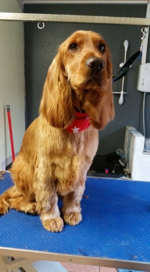
This photo is a useful one. It is a beautiful capture of the cocker spaniel, clear around the eyes and with light on the coat.
But we don't need all the faff in the background. So I upload the photo to Photoshop on the computer and edit it.
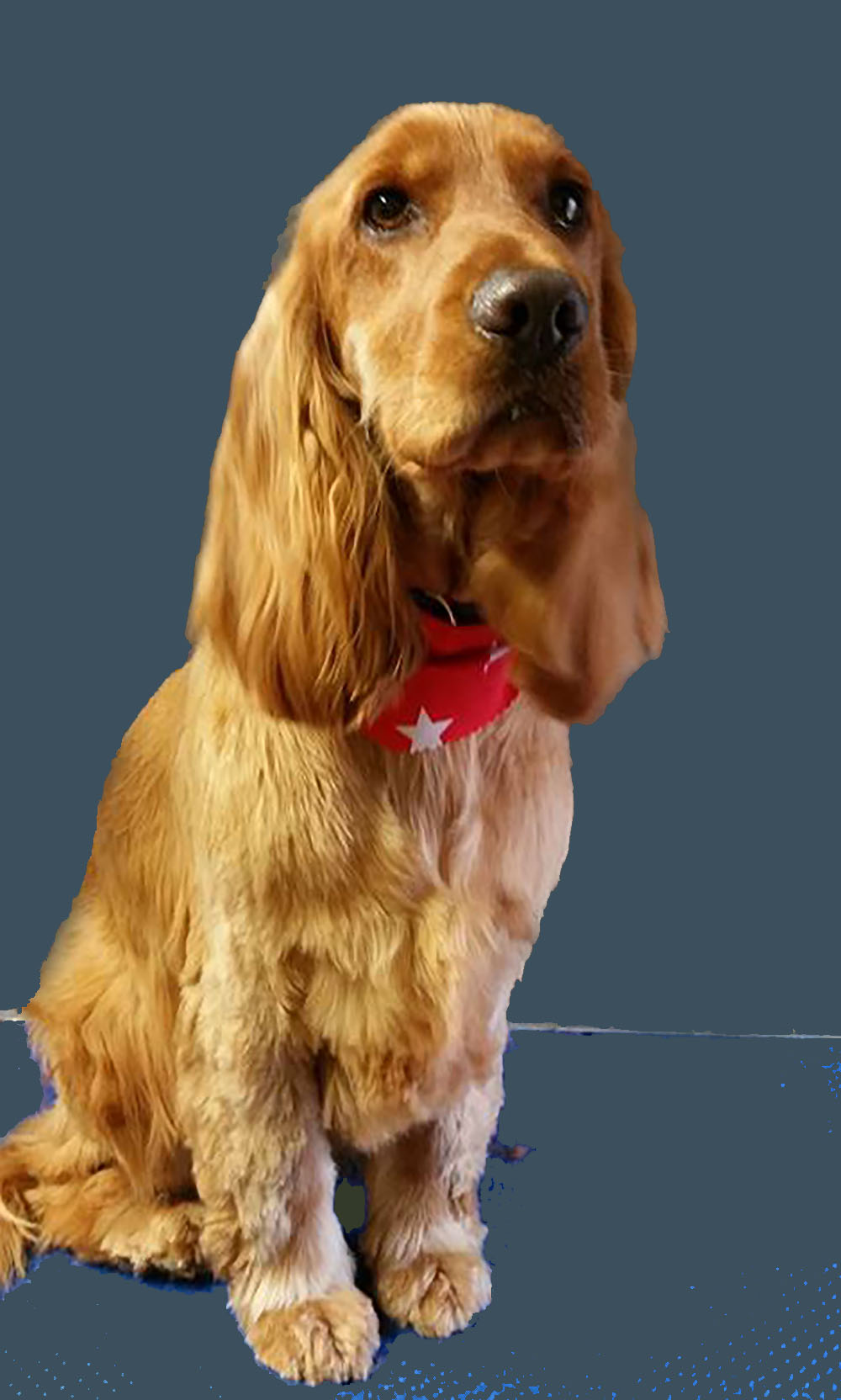
Firstly the photo needs rotating a little bit to the right, to bring the figure of the dog to a more upright position.
Next I use the magic wand selection tool, fill tool and paintbrush on photoshop to colour the background in black or grey.

Now that we have got rid of all that unwanted 'busyness' behind the dog, it is much easier to concentrate on finding a main background colour that will give the finished piece the desired look.
If I want the spaniel to really 'pop' out from the background, I would pick a complementary shade like these examples below. The ginger colour of this Cocker Spaniel will be roughly opposite to the blues and greens on the colour wheel, so I will choose some of those and see how it looks. In Photoshop it is easy to change the background colour with a couple of clicks.
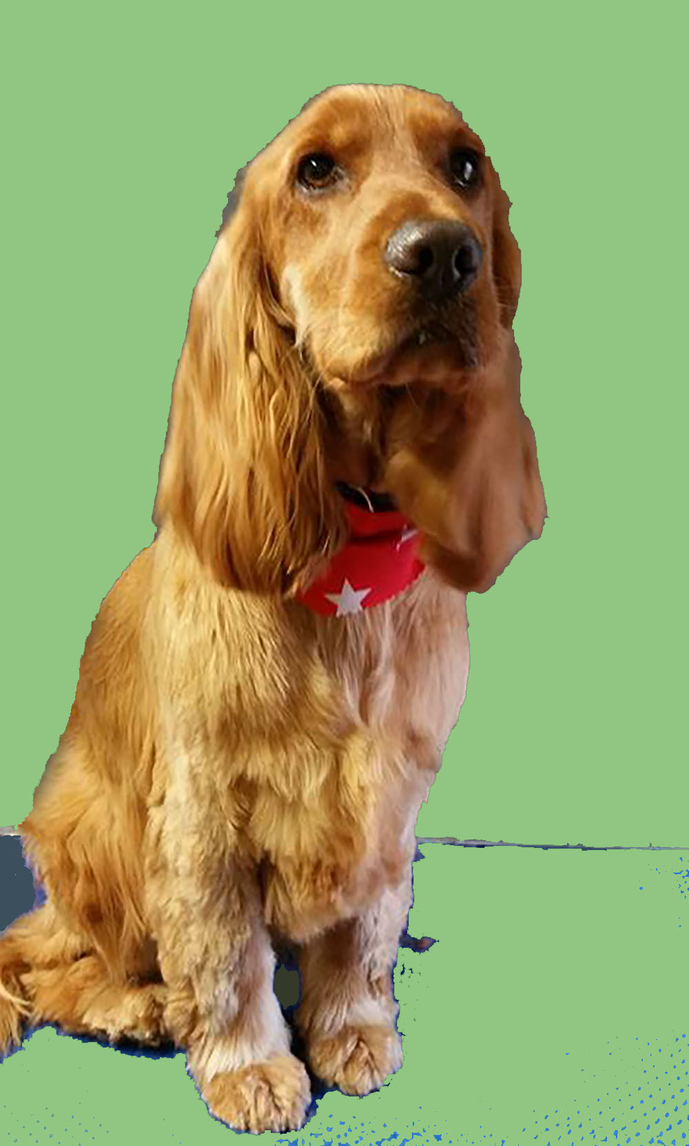
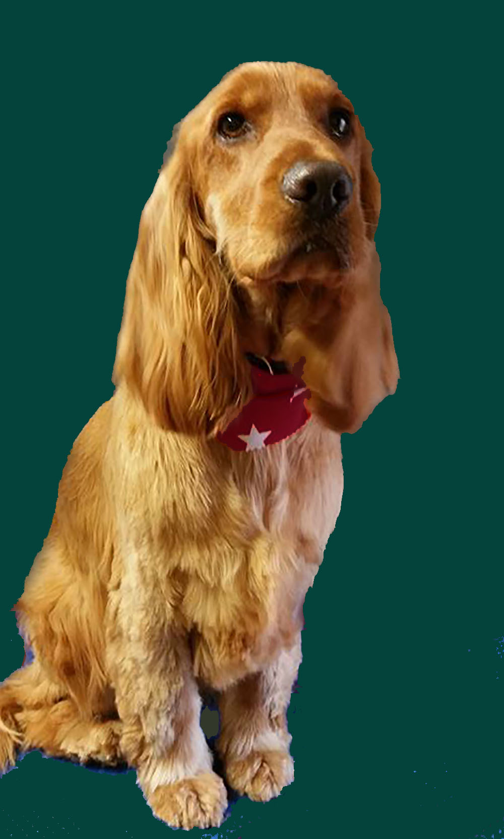
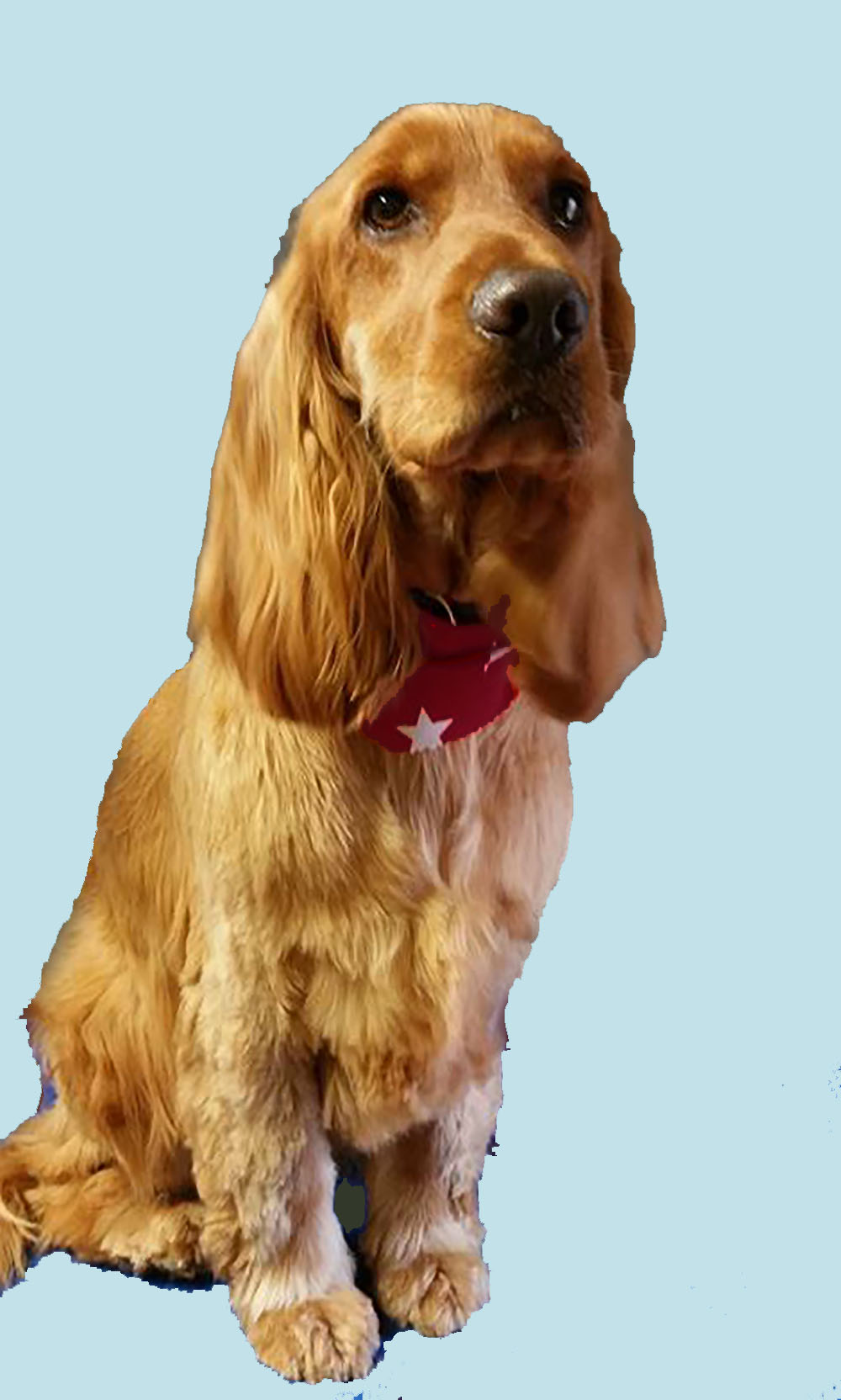
It all helps just to give a rough idea of what will work. Out of the above colour choices I like number 1 and number 3, and would be quite happy to use either as a base colour for my background.
Natural colours
Another option is to choose a colour from the dog's own coat as a starting point. This gives a cohesive look that is easy on the eye. In the image below I have used the colour dropper selection tool to pick out some gingery browns from the dog's face and then filled the background with each colour, first dark maroon and then burnt orange.
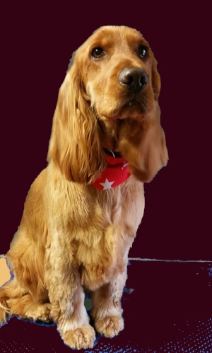


The results are pleasant, and they tie in nicely with the colours in the dog, to make a colour scheme that would be easy to live with.
I like both, but for the purposes of this demonstration I will choose the maroon option. Using an overlay in photoshop over the bright red bandana tones it in with the rest, and a second semi transparent maroon layer over the whole photograph ties it into a definite colour scheme.
Ready to crop!
This is the finished colour selection. I would usually now decide whether to to crop the image, and have a look at a few different layouts with cropping in Photoshop. Then it is time to start drawing and painting.