news


Mixing greys - oil painting
I love making greys to use alongside the bright pure shades on my palette. Grey can be really quite beautiful, and they help to balance a painting. It is always useful to have some mixed ready to use so I mix mine before I start painting. I choose the main tube colours that I'm using and mix my grey from them. My intention is to have piles of mixed greys in a selection of values so that I have the correct value to hand.

This is a 45 x 35cm painting on canvas, in which I used lots of mixed greys for the shadows.
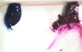
The most obvious way of mixing a grey is to mix black and white together. But there are better ways to create more vibrant and lovely greys. Mixing two complementary colours and a little white is effective, because complementary colours 'grey' each other down. You can quickly reduce the intensity of pure colours by adding a small amount of the opposite colour on the colour wheel. Or add a little of a mixed grey.
I like to mix greys from:
Viridian and Magenta/Alizarin Crimson + white
Ultramarine and Orange + white
Burnt Sienna and Prussian Blue + white
But there are lots of effective combinations, it is worth experimenting.
* Learn to Paint - join me at my workshops
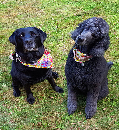
How to paint a black dog

'Flopdown' soft pastel painting 30 x 40cm
Tip 1) Get someone to hold onto him really tight while you do it.
I'm kidding, but the question of how to paint a black dog is one that is often asked. They are tricky to photograph and paint. It can be hard to actually see them in the picture. The best pictures of black dogs make good use of lighting to highlight the form and expression.
I painted this short demo video to share with you. It shows one way to paint a black dog against a dark background, using oil paints. The surface I am painting on is primed fine linen on board 20x30cm
Why not sign up for my artists workshop newsletter and get early access to course dates and online course releases? Sign up below!
Mixing the colours
I dont use a tube of black paint for the colour of the dog and/or background. I do have some useful darks such as Asphaltum, Chromatic Black and Perylene Black, but I usually mix a dark colour from a combination such as Ultramarine and Burnt Sienna, or Magenta and Viridian. I always think a mixed colourful dark looks lively and interesting, as opposed to using too much black squeezed from a tube.
Once my darkest colour is mixed, i put it at one end of my glass palette, and I mix gradients of it in a range of values to use in my painting. I might mix two or three dark shades and then draw them out in this way. I mix white with a really tiny bit of the main colour for my lightest shade, so that it doesn't look too harsh/chalky.
Bear in mind that a photo reference will often bleach out the lightest light colour to appear lighter than you want it. The shadows usually appear darker than in reality. Shadows on photos can also seem flat and one dimensional. Use varied hues in shadows to bring them to life.
Dog Portraits for Christmas - All safely delivered
This week and last, I have been getting Christmas orders for dog portraits packed up and off to their new homes.
I have had a lovely selection of beautiful dogs to paint!

This is a portrait of Gilbert, a handsome Border Terrier. And a very good boy, by the look of him .

This little lady is Lola, a young and lovely Cavapoo (Cavalier King Charles Spaniel x Poodle)
Here are a couple of the oil paintings that went to new homes this Christmas. Gilbert the Border Terrier was painted on a stretched canvas 40cm x 25cm. Lola the Cavapoo was also painted in oils, on a canvas panel 25 x 30cm
Green Gold PY 129 - a surprising and versatile colour
The Green Gold by Winsor and Newton is one of my usual choices because it is so useful and interesting in mixes, makes gorgeous glowing whites and is also really good for glazing. It is a transparent oil paint with excellent lightfastness, and very soft and buttery.

I am not sure how I stumbled upon this colour but it appeared in my kit soon after I started in oil painting and was largely ignored for a while as I explored the more obvious choices. One day I mixed a little of this deep vibrant green with titanium white and was surprised as the rich bright and light lemon that I arrived at. Further experiments showed that this was a great colour to mix with reds and pinks, producing lovely rich earth tones and oranges. I also like to use it in shadows along with blue and purple.
I use this fabulous green a lot now, and always order another tube before I run out of the last, which goes to show how much I like it. I haven't painted many human portraits yet, but when I do, I have a feeling that this colour will be excellent for making skin tones.
My favourite colours to mix with Green Gold so far are:
Brilliant Pink
Cobalt Turquoise
Magenta
Ultramarine
Alizarin Crimson
Titanium White

From Left to Right: Green Gold in Mixes with White, Turquoise partially and fully mixed, Magenta and Ultramarine
What Oil Paint Colors Should Beginners Buy?
Starting your oil painting journey? Not sure which colors you need? Check out this beginner's guide to familiarize yourself with the essential oil paints every beginner should buy.
I firmly believe that we can all learn to draw, paint and handle colour. it is not about 'talent', and it is not about a special secret that only a few select people can be 'born to do'. Creating art is a skill like any other, it just takes practice. Just like learning a foreign language or learning an instrument. No one expects to be fluent at French, or brilliant at Piano after just a couple of lessons. If you really want to learn to paint and draw, it is all there for you.

Mixing colours does take practice. First attempts can yield some surprising results. It can feel annoying. To have what 'ought' to be a beautiful purple turn out to be a big pile of mud.
Check your colours
If colours arent coming out as expected or hoped, take a fresh look at your primary colours. If you only have three, see what you have there. You might have a 'warm' yellow-toned blue (such as cerulean or pthalo blue. Mix with a cool red and you may get a flat brown-grey. What has happened is that your warm (yellowish) blue has yellow tones which are canceling out the purple in the mix. For a true purple, you would need to use two cool shades (cool blue ie french ultramarine x cool red ie Magenta) Neither of those two shades are yellowish, so you will see rich and vibrant purples in the mixture.
Mixing rich purples
In these three images below I begin with two piles of paint. The red is Scarlet Lake, and the blue is Cerulean Blue. If I was hoping to mix these and get a rich purple I would be disappointed. Mixing the warm red and the warm blue produces a maroon shade.


Compared to these colours below, which are both cool and make some vibrant true purple tones when mixed thoroughly together. ( Although that purple still needed a bit more mixing because we can see a touch of the magenta that has not been blended in on the left of the second photo.)

Mixing bright warm oranges
When trying to make a bright orange, it really needs to be warm colours without too much blue in them. So you could choose a warm yellow and a mid red or warm red (tending toward orange rather than purple) This will give the truest orange.
If you are mixing cool 'bluish' yellow and red, these colours will contain too much of that third colour (blue), which is the complimentary of orange, and will therefore cancel out the rich orange tones.
Greying/toning colours down
That being said, it is also necessary to know how to mix all of the greyed-down shades, so we can use a beautiful variety of colour and values in our paintings. Small amounts of complimentary colour added to a pure colour will grey a colour down or 'knock it back' and make it less intense.
Making Green Less Vivid
If you look at your green paint and it is too vivid for what you need it for, too 'green', try adding a tiny amount of one of your reds. If it is a bright yellowy (warm) lime green try adding a (cool) crimson. If on the other hand your green is (cool)blueish, you can add a small amount of (warm) scarlet. Only add really tiny amounts of your adjustment colour, and mix it well, before you add any more or you really could make mud. It is so surprising how little you need to add in to alter a mix. TINY amounts really.
Warning! colour mixing can be addictive and fun.
By the way, I recommend mixing paints with a palette knife, not a brush. Mixing paints with a brush pushes paint up into the ferrules where it soon ruins the shape. It is also much easier and quicker to wipe a palette knife clean. You can scrape up a good pile of mixed paint and move it about with your palette knife. It is a good idea to mix up a bit more than you think you'll need, particularly if you are going to mix the final colour with white to make tints.
Three dark colours made by mixing with (l to r) Viridian x Magenta, Magenta x Ultramarine and Ultramarine and Scarlet Lake
Select the right colours
While starting out, I would suggest having two of each of the primary colours. A cool and a warm version of each. So you would have a warm blue (tending towards yellow) such as a Cerulean. A cool blue such as an Ultramarine. A warm red such as a Cadmium Red or a Scarlet Lake. A cool red or crimson. A warm yellow and a cool shade of yellow, like a lemon yellow.
And maybe get a few tubes of 'guest' colours as well which are great to add to mixes, such as yellow ochre, burnt sienna, cobalt turquoise. You will need a titanium white or an 'off white' I love Warm white by Gamblin.
Mixing some colours - where to start
The simple thing to remember is that you can only alter a paint colour in 7 ways. You can only make it:
1) Lighter - by adding a little white or other lighter shade
2) Darker - mixing in black is the simplest way, but you can also add another darker colour
3) Brighter - by adding a more intense shade
4) More dull- you can tone intensity down by adding a little of the complimentary colour
5) More yellow
6) More red
7) More blue

Practice is key
I have found the following colour mixing exercise helpful . It involves trying to re create set colours exactly as you see them.
Compare results
Start with the tube of paint you have that is closest to the colour you want to mix. And then add whatever you need to alter it to the new mixture. Keep mixing it with the knife for a while after you think you have finished. This is because if the colour is not properly and completely mixed, you will not get a true reading of the colour at all, and if you try and modify it without a proper reading it will suddenly morph into something quite different than the colour you were expecting. So keep mixing it until there are no little traces of the original colours.
The seven possibilities.
Remember to make it either 1) lighter, 2) darker 3) brighter 4) more dull 5) more yellow 6) redder, or 7) bluer.
That is all you need to do, and only add tiny bits at a time!
Use your new skills
After practice, you will definitely feel a lot more confident mixing colours. You'll find you quickly start to develop an 'eye' for colour and value which you can use straightaway in your next painting!
My Favourite Brands
Here are the links to my favourite brands- these are affiliate links where you will receive 10% off your first order.
Paint a dog portrait in oils - how to choose a background colour
Painting a dog or cat portrait and unsure what background colours to use? Here are a few ideas:
Select a colour scheme

'Penny' Oil on panel 30 x 25 cm
This tiny little Chihuahua was painted using a limited palette of Transparent Maroon, Blue black, Warm White and Radiant Yellow
Before starting on a pet portrait painting decide on a colour scheme and a composition for the new piece. The colour scheme might be a striking one with clashing colours for dramatic effect, or a more gentle blend of similar shades, with soothing harmonious tones. Consider the background and the colours for the dog all at the same time, at the beginning. This helps to create a well planned piece, and ensures that the final goal can be seen right from the start. You definitely don't want to get mid way through painting a portrait and have to start making major decisions about colour.
When the portrait is a commission that I am painting, the client will request a certain colour to be included in the piece, perhaps a duck egg blue background, or lime green tones, and I can use that information when planning the painting.
Painting from photos selectively
I wouldn't always suggest painting from photographs, and I myself rarely use photo references for still life or floral paintings. For pet portraits though, working from photos is necessary for practical reasons. Commissions purchased on the website are often long-distance, international, or may be of dogs that are sadly no longer with us. So reference photos are essential, but they have their limitations.
I don't necessarily try and replicate the very same colours that are present in the photo. They may not translate well into a painting. One of the great things about painting a picture is it gives us the opportunity to move things around, and have things as we like them to be.
For instance in this picture, the dogs are amazing (I'm biased) But I would try and think about whether I want the painting to be green based, just because the photo has grass.
Reference pictures are great as a guide to form and facial expression, capturing the likeness, and as a guide to placement of the pet's markings. The rest of the piece is up to the artist and it mainly comes from inside your head and heart!
Keeping things cohesive.
Start with one base colour and add more layers of colour as the painting progresses. I always paint the subject and the background at the same time, putting any spare brushfuls of 'dog colour' into the background . One reason for this is it helps to make the subject look as if it belongs there. I love portraits where the dog or cat does not look 'lost' in the middle of the canvas. Using a unified colour scheme, and painting the dog and background at the same time helps with this.
The dog is the star!
The background in a dog portrait can be soft and a bit abstract, which has the desirable effect of putting the pet centre stage on the canvas. For this reason you can choose not to paint detailed scenery in the background.
Planning the scheme - using Photoshop to save time (and paint!)
I use Photoshop in the planning of my paintings. It makes it easier to assess an image and set up a pleasing composition before the painting begins. This will save so much time in the long run. Of course you can use other methods such as making small thumbnail sketches and colour studies. These are also useful exercises where time allows. For speed when I have several commissions to plan, I use the Photoshop way. (I didn't always plan my paintings. I used to prefer to put the big shapes and bright colours down straight onto the canvas within five minutes of deciding what to paint. I would then whittle away at the painting, eventually finishing with the little details . And it can be quite effective and fun to paint that way. But when the painting is a commission with an agreed deadline it makes more sense to follow a plan with a confidently known outcome! )
Here is an example of a reference photograph and I'll show you the tweaks I make before I start painting:
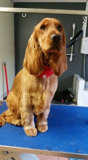
This photo is a useful one. It is a beautiful capture of the cocker spaniel, clear around the eyes and with light on the coat.
But we don't need all the faff in the background. So I upload the photo to Photoshop on the computer and edit it.
Firstly the photo needs rotating a little bit to the right, to bring the figure of the dog to a more upright position.
Next I use the magic wand selection tool, fill tool and paintbrush on photoshop to colour the background in black or grey.

Now that we have got rid of all that unwanted 'busyness' behind the dog, it is much easier to concentrate on finding a main background colour that will give the finished piece the desired look.
If I want the spaniel to really 'pop' out from the background, I would pick a complementary shade like these examples below. The ginger colour of this Cocker Spaniel will be roughly opposite to the blues and greens on the colour wheel, so I will choose some of those and see how it looks. In Photoshop it is easy to change the background colour with a couple of clicks.
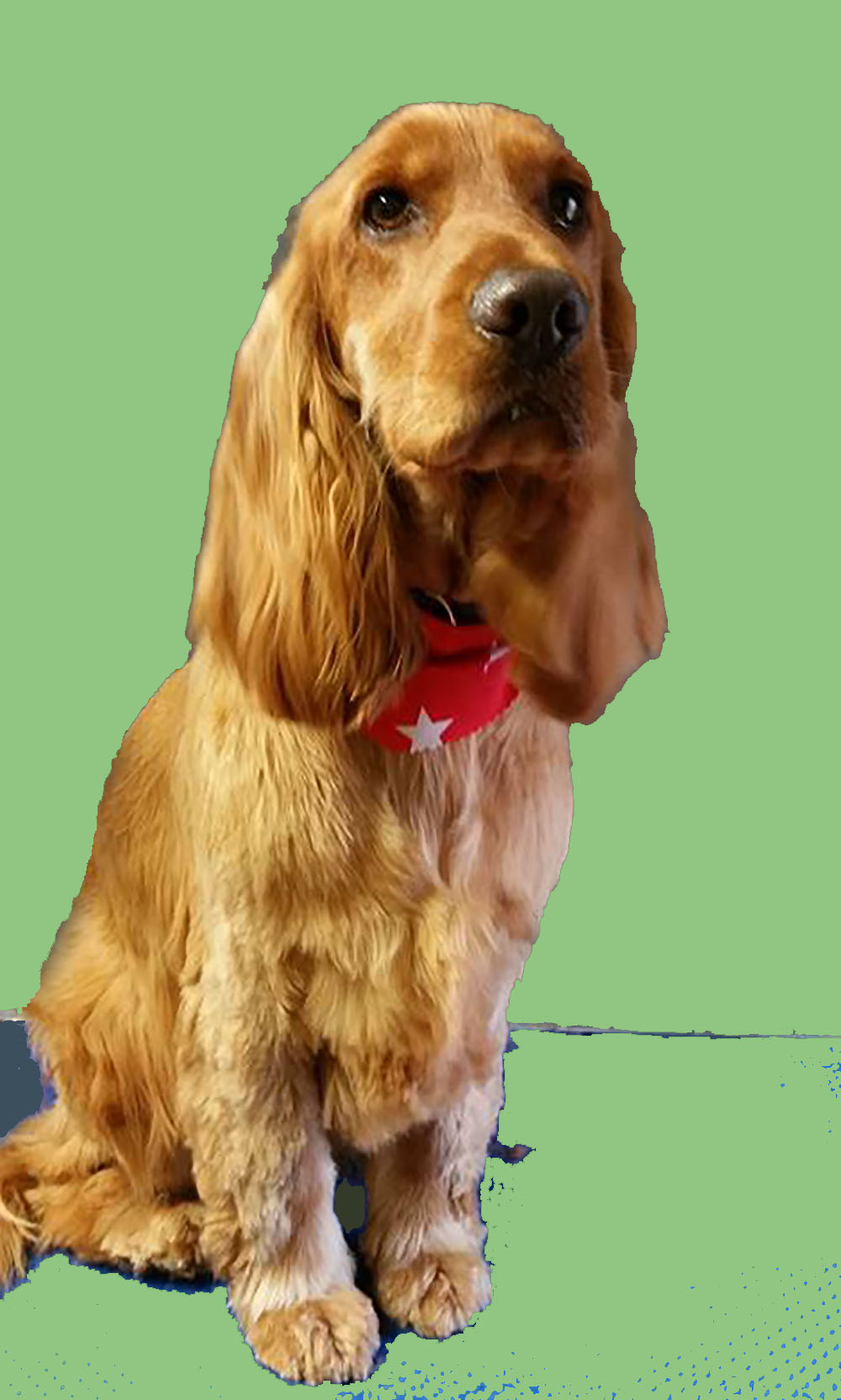
It all helps just to give a rough idea of what will work. Out of the above colour choices I like number 1 and number 3, and would be quite happy to use either as a base colour for my background.
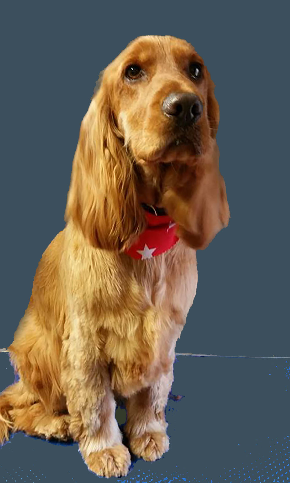
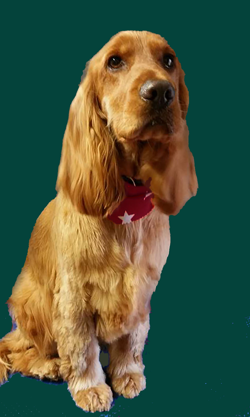
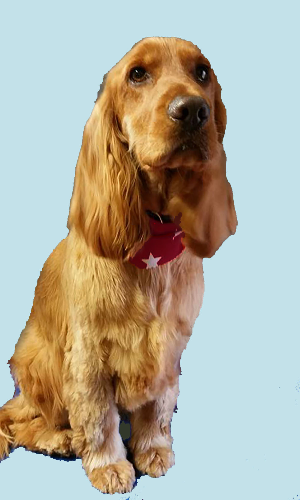
Natural colours
Another option is to choose a colour from the dog's own coat as a starting point. This gives a cohesive look that is easy on the eye. In the image below I have used the colour dropper selection tool to pick out some gingery browns from the dog's face and then filled the background with each colour, first dark maroon and then burnt orange.


The results are pleasant, and they tie in nicely with the colours in the dog, to make a colour scheme that would be easy to live with.
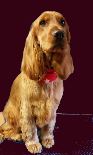
I like both, but for the purposes of this demonstration I will choose the maroon option. Using an overlay in photoshop over the bright red bandana tones it in with the rest, and a second semi transparent maroon layer over the whole photograph ties it into a definite colour scheme.
Ready to crop!
This is the finished colour selection. I would usually now decide whether to to crop the image, and have a look at a few different layouts with cropping in Photoshop. Then it is time to start drawing and painting.
Portrait of a Cavalier
Portrait of a Cavalier
November 24, 2017
This portrait is one that I painted with an exhibition in mind a couple of years ago, and she now hangs on the wall of the reception in Mutley's of Ashby boutique. I used loads of 'creative license' during the painting of this piece. I referred to the photograph (below, kind permission of photographer Kerli Toode) for the main concept and some of the details , and then added my own ideas to create a piece with individuality.

Here is the reference picture that I used for the Cavalier Spaniel painting, by kind permission of photographer Kerli Toode
The finished oil painting is 60 x 80cm in oils on stretched canvas
Dalmatian Dog Portrait, Work in Progress
This piece is very nearly finished now. I have glazed the background in a few thin layers of Transparent Maroon (Winsor and Newton) and softened the edges on the shadow side of the dog. I like the warm effect. I have also altered the shape of his face slightly as I didnt have it quite wide enough after the first sketch and washes. I have to do a little work on his Right (our left) eye, and then he will be complete and ready to go on the wall.

'Donny' work in progress, final stages
Below is the reference photo that I took to work from for the Dalmatian painting. I cropped and adjusted the image in Photoshop first till I was happy with the composition.

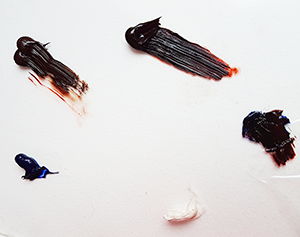
Capturing a small dog's nose using oil paints.
This week I am beginning a large oil painting featuring five Shih Tzu dogs. The portrait is a commission, and it is the biggest group dog portrait I have attempted to date. I am excited about it! The models are adorable, and one of their recognizable features is this tiny little button nose that they all have.

I'm going to share a step-by-step account of how I paint these little dog's noses. Above is my reference photo for this painting.
I chose these four oil paints for the exercise. There is one 'white' I prefer an off-white such as this Zinc Buff or Warm White as an easy way to avoid a chalky look. I also selected an Ultramarine Blue and a Transparent Maroon which I will mix to make a 'black', and a new Red Umber which I want to try.

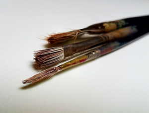
These are the 3 brushes that I used for this small piece. Bearing in mind that the whole canvas is only 20 x 25 cm, none of these brushes are very big. I used a 1/2" Eclipse Comber brush to lay in the first wash and the initial big shape. The middle size brush is an Ivory series 2 which I used to lay in the lighter tones. The thin brush that I placed the tiny highlights with with is an Eclipse Rigger size 0. You could easily manage the exercise with just the two smaller brushes if you needed to.
I am going to paint this dogs nose on a small canvas panel that I have to hand. The panel has been painted on previously so there is already some colour on the surface. I recycle my old boards when paintings don't work out (I have quite a stack of these panels now!). You can use any surface for the exercise, gessoed surface such as board, paper or card or a spare small canvas.

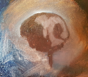
Start with a semicircular shape using a fairly dark colour. I chose the umber but, but any opaque colour would do. As this is a shape that will be painted over, use very little medium on this layer. (Thicker paint can be painted over with successive thinner layers.) The shape isn't perfectly symmetrical because the dog is looking to the side. Notice that the sides are not level, but don't worry too much about making it perfect at this stage.

Extend the nose shape downwards and draw in in the centre line, slightly off center to the right to indicate which way the dog is facing and where the light should fall.

Once the basic shape is down on the canvas, take a small brush full of the light colour and paint it directly onto the canvas over the brown, to indicate the areas where the most light falls. The dark and light colours will naturally mix a little on the canvas to create a mid-tone
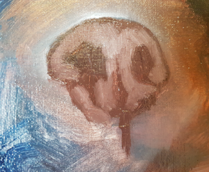
Add more of my light colour to light areas on the dog's nose and leave the areas in between. The structure of the dog's nose begins to appear. At this point I don't do very much blending or editing, that can be done a bit later on towards the end of the session. Don't examine your work too closely right now just keep painting!

Now for another layer of 'lights', laying the third layer in, using the white/off white paint. These are the lightest parts of the nose. The most prominent areas where the greatest amount of light hits the nose, once highlighted will really bring the feature to life. There are little shining highlights on tiny areas of moisture around the nose, and on miniscule hairs here and there. Use your very smallest brush for these.

Next add the darkest colour. I made mine by mixing my blue and the maroon. This makes a deep, rich and slightly transparent dark colour, much more vibrant and lively than a tube black would be. But you could use black, or any dark colour you have to define the nostril areas further and create a little shadow on the left side of the nose.

This particular dog has a white marking around his nose, so start to take the light colour outwards. We are adding the base colour for the dog's face, but also using the opportunity to correct and further define the outline shape of the nose, by painting over the edge with light colour where it is needed. Because the oil paint is so soft, it is easy to make small corrections like this.


Adding some of the light areas around the nose, filling in the large shape. Details can be added in later.

Here you can see that I have started to add some lines to describe the hair growth on the dog's top lip. This is only a rough placement to get the paint in place, and I will go back and 'scruff it up' a bit later, to make it look less harsh, more natural.


This is the first 'draft' finished. I went back in to 'scruff' up some of that light colour under the nose, by very lightly dragging my brush across horizontally twice. The wet oil paint easily blends and softens with just a couple of strokes of the brush. I will leave this painting now and let it dry overnight.
Tomorrow it will be dry enough to paint a second layer, because I have used liquin medium.
Dog Portrait Commission - Work in progress
This is a commissioned portrait that I am working on this week, although it is time for Christmas commissions, this one happens to be a birthday gift. I haven't met this lovely spaniel but from the photographs I can see that he is the family bear and a very good boy :)
This is just a little corner of the work, which is 45cm x 35cm oil painting on a premium stretched canvas. I am using some beautiful new oil colours that I have selected from the Williamsburg earth tones palette, I am falling in love with them as I paint, these are such good quality pigments.
