news
Which paint do I use?
I have had a few requests recently asking which paints I use in my workshops. So far, all of my workshop days have been using acrylic paints, because they dry really fast and this allows artists to easily take away their paintings at the end of the day. I have used several different brands of acrylic paint, and these Daler Rowney System 3 are the ones that I have found striking the right balance between quality and affordability. The colours are nice and bright, and there is a good choice. They seem to stay usable in the palette for longer than some of the others, too. I use the big tubs because we get through such a lot of paint, but these are also available in smaller tubes. I’ll share links to the places that I buy mine here here,
Painting Birds - Workshop next weekend!
Im getting really excited about this now! This will be my first 2 day painting weekend workshop and Im holding it at Sharpes Pottery Museum, one of my favourite venues! This week I will be sourcing as many lovely woodland bird reference images as I can find, so that there is plenty of choice. Each guest will get the chance to paint three small bird canvases over the weekend. We will explore the shaped and markings and habitat of the birds themselves, and place them into beautiful light filled woodland settings from our imagination.
There is still time to join us - information on booking here.
Beautiful new oil painting colour released by Michael Harding!
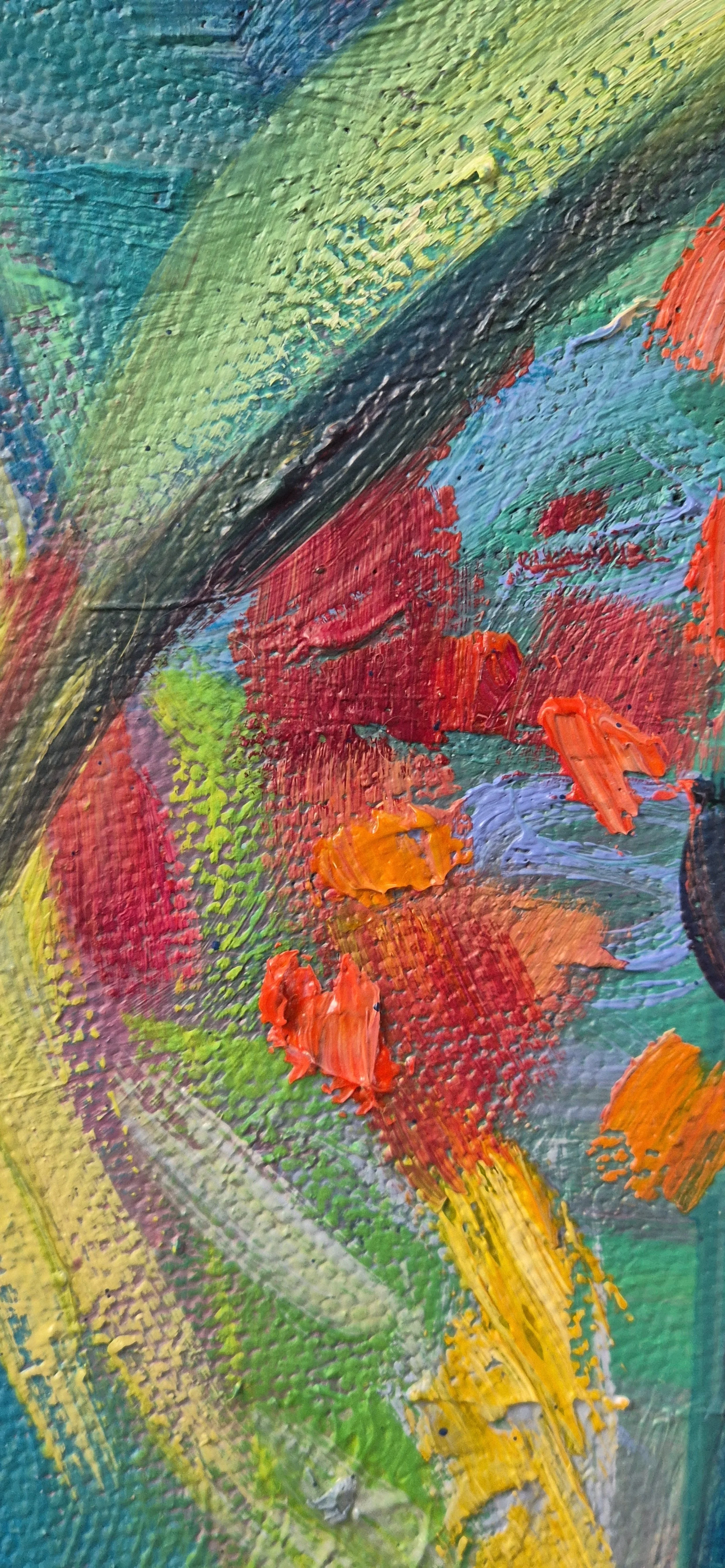
Im always excited to be trying new oil paint colours and I knew I would love this one as teal is a favourite. The pigment here is pg50 which is stunning. Michael Harding oil paints seem to always be exceptional too, I have never been disappointed!
What Oil Paint Colors Should Beginners Buy?
Starting your oil painting journey? Not sure which colors you need? Check out this beginner's guide to familiarize yourself with the essential oil paints every beginner should buy.
I firmly believe that we can all learn to draw, paint and handle colour. it is not about 'talent', and it is not about a special secret that only a few select people can be 'born to do'. Creating art is a skill like any other, it just takes practice. Just like learning a foreign language or learning an instrument. No one expects to be fluent at French, or brilliant at Piano after just a couple of lessons. If you really want to learn to paint and draw, it is all there for you.
Mixing colours does take practice. First attempts can yield some surprising results. It can feel annoying. To have what 'ought' to be a beautiful purple turn out to be a big pile of mud.
Check your colours
If colours arent coming out as expected or hoped, take a fresh look at your primary colours. If you only have three, see what you have there. You might have a 'warm' yellow-toned blue (such as cerulean or pthalo blue. Mix with a cool red and you may get a flat brown-grey. What has happened is that your warm (yellowish) blue has yellow tones which are canceling out the purple in the mix. For a true purple, you would need to use two cool shades (cool blue ie french ultramarine x cool red ie Magenta) Neither of those two shades are yellowish, so you will see rich and vibrant purples in the mixture.
Mixing rich purples
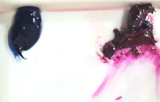
In these three images below I begin with two piles of paint. The red is Scarlet Lake, and the blue is Cerulean Blue. If I was hoping to mix these and get a rich purple I would be disappointed. Mixing the warm red and the warm blue produces a maroon shade.
Compared to these colours below, which are both cool and make some vibrant true purple tones when mixed thoroughly together. ( Although that purple still needed a bit more mixing because we can see a touch of the magenta that has not been blended in on the left of the second photo.)
Mixing bright warm oranges
When trying to make a bright orange, it really needs to be warm colours without too much blue in them. So you could choose a warm yellow and a mid red or warm red (tending toward orange rather than purple) This will give the truest orange.
If you are mixing cool 'bluish' yellow and red, these colours will contain too much of that third colour (blue), which is the complimentary of orange, and will therefore cancel out the rich orange tones.
Greying/toning colours down
That being said, it is also necessary to know how to mix all of the greyed-down shades, so we can use a beautiful variety of colour and values in our paintings. Small amounts of complimentary colour added to a pure colour will grey a colour down or 'knock it back' and make it less intense.
Making Green Less Vivid
If you look at your green paint and it is too vivid for what you need it for, too 'green', try adding a tiny amount of one of your reds. If it is a bright yellowy (warm) lime green try adding a (cool) crimson. If on the other hand your green is (cool)blueish, you can add a small amount of (warm) scarlet. Only add really tiny amounts of your adjustment colour, and mix it well, before you add any more or you really could make mud. It is so surprising how little you need to add in to alter a mix. TINY amounts really.
Warning! colour mixing can be addictive and fun.
By the way, I recommend mixing paints with a palette knife, not a brush. Mixing paints with a brush pushes paint up into the ferrules where it soon ruins the shape. It is also much easier and quicker to wipe a palette knife clean. You can scrape up a good pile of mixed paint and move it about with your palette knife. It is a good idea to mix up a bit more than you think you'll need, particularly if you are going to mix the final colour with white to make tints.
Three dark colours made by mixing with (l to r) Viridian x Magenta, Magenta x Ultramarine and Ultramarine and Scarlet Lake
Select the right colours
While starting out, I would suggest having two of each of the primary colours. A cool and a warm version of each. So you would have a warm blue (tending towards yellow) such as a Cerulean. A cool blue such as an Ultramarine. A warm red such as a Cadmium Red or a Scarlet Lake. A cool red or crimson. A warm yellow and a cool shade of yellow, like a lemon yellow.
And maybe get a few tubes of 'guest' colours as well which are great to add to mixes, such as yellow ochre, burnt sienna, cobalt turquoise. You will need a titanium white or an 'off white' I love Warm white by Gamblin.
Mixing some colours - where to start
The simple thing to remember is that you can only alter a paint colour in 7 ways. You can only make it:
1) Lighter - by adding a little white or other lighter shade
2) Darker - mixing in black is the simplest way, but you can also add another darker colour
3) Brighter - by adding a more intense shade
4) More dull- you can tone intensity down by adding a little of the complimentary colour
5) More yellow
6) More red
7) More blue
Practice is key
I have found the following colour mixing exercise helpful . It involves trying to re create set colours exactly as you see them.
Compare results
Start with the tube of paint you have that is closest to the colour you want to mix. And then add whatever you need to alter it to the new mixture. Keep mixing it with the knife for a while after you think you have finished. This is because if the colour is not properly and completely mixed, you will not get a true reading of the colour at all, and if you try and modify it without a proper reading it will suddenly morph into something quite different than the colour you were expecting. So keep mixing it until there are no little traces of the original colours.
The seven possibilities.
Remember to make it either 1) lighter, 2) darker 3) brighter 4) more dull 5) more yellow 6) redder, or 7) bluer.
That is all you need to do, and only add tiny bits at a time!
Use your new skills
After practice, you will definitely feel a lot more confident mixing colours. You'll find you quickly start to develop an 'eye' for colour and value which you can use straightaway in your next painting!
My Favourite Brands
Here are the links to my favourite brands- these are affiliate links where you will receive 10% off your first order.

