
news


An Oil Painting Demonstration
An Oil Painting Demonstration
Last week I was delighted to attend the Desford and Peckleton Art Club. Theirs is an evening meeting so I arrived at 1830 to set up my easel and get my paints ready. The demonstration ran between 1915 and 2100 with a tea break in the middle.
It is always a strange experience, to paint in front of a group of people. Just as in the studio, you hope that you will achieve the desired results but you never quite know. It’s exactly the same when folk are watching and listening, with the added chance of making yourself look like a fool!
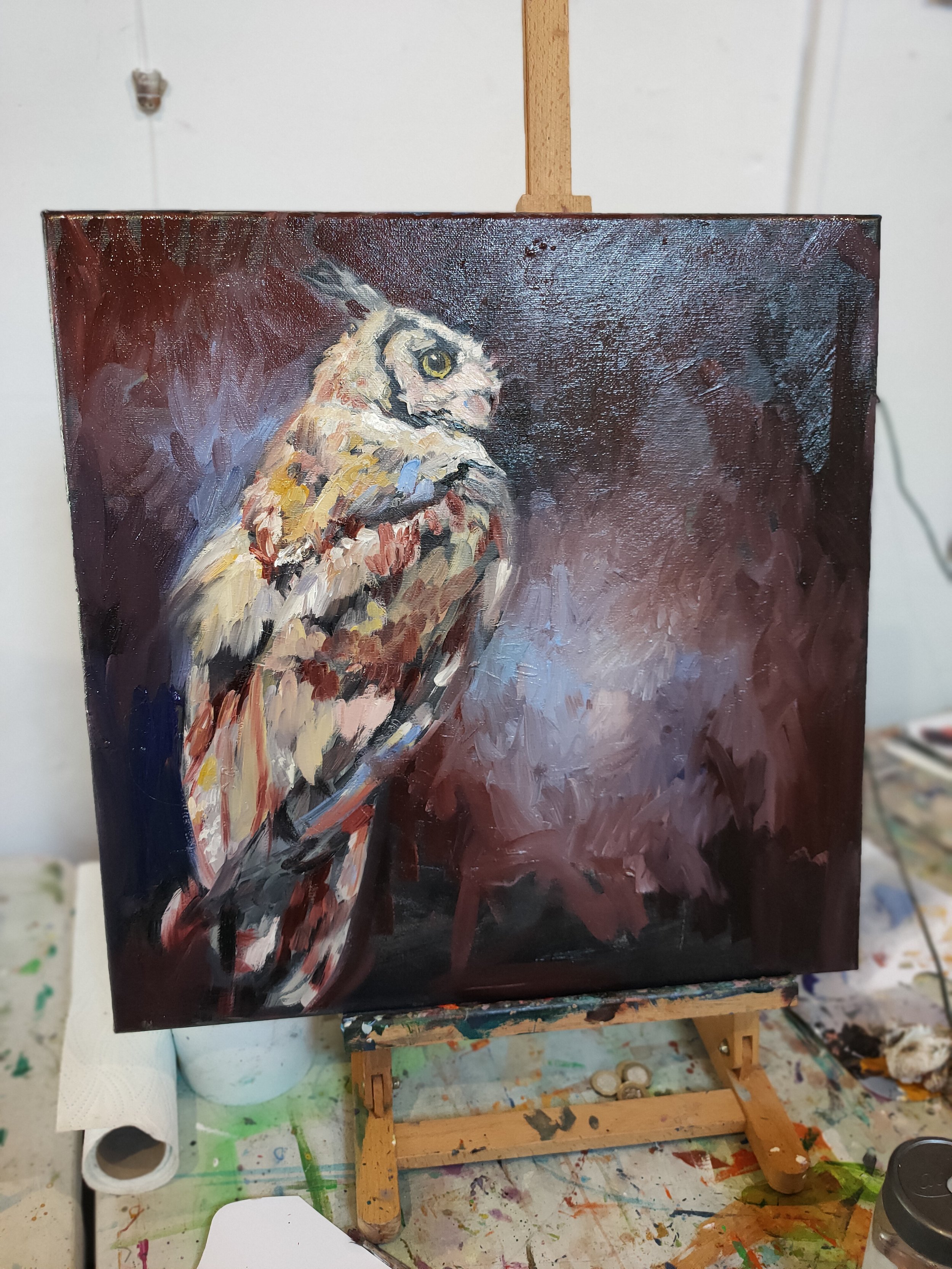
I decided that I would demonstrate some of the current ideas I’m working on so that I could show my thoughts and decision-making process in ‘real-time’. I took one piece that I had already made a start on, the week before. And one blank canvas that I had prepared with a rough coat of black oil paint as a base.
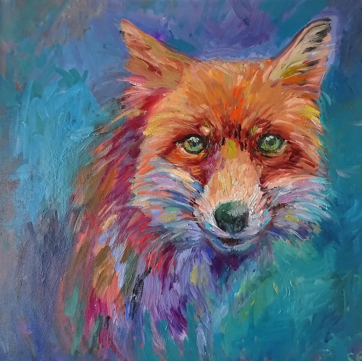
Both pieces were of the same Eagle Owl in different poses. These were photos that we had taken of Max, one of the owls at the Rosliston Owl Centre on our visit back in April.
With the first piece, I was able to show how I begin a painting by working straight onto the canvas with a large brush. How I map out the composition, and my thought process when deciding where everything should go. In the second painting, I showed how I progress a piece after the first layer is dry, working back into the piece in glazes of colour and editing as I go along.
It was a very nice evening and hopefully it was interesting for the group of artists.

Ready to start layer 2, bac at the studio
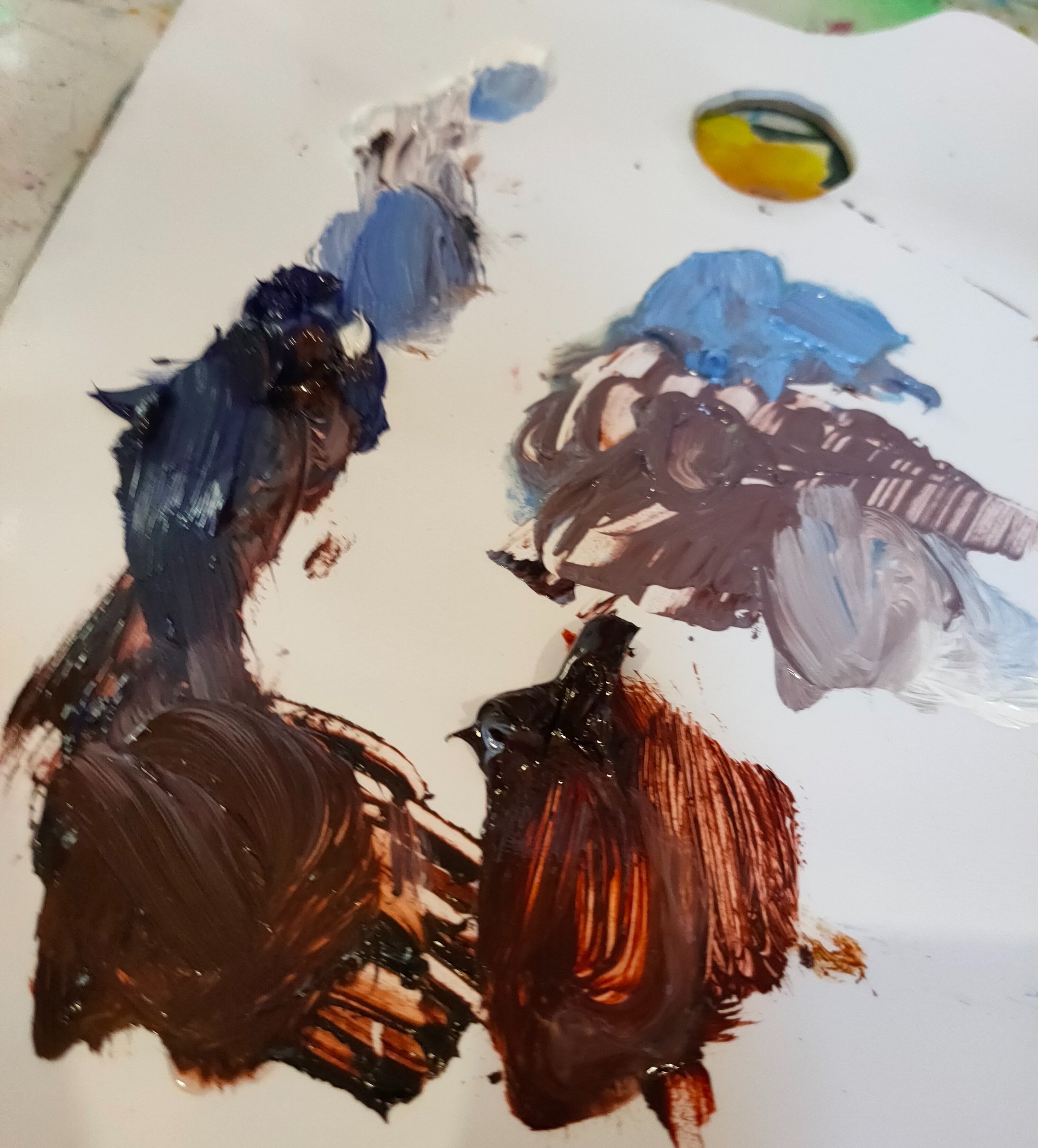
My colours were transparent maroon, ultramarine and white
I had to dash away quickly at the end, as I turn into a pumpkin at sunset. This is due to my impaired vision not allowing me to drive after dark. Particularly on unlit country roads. I think this will preclude my attending evening groups in future, however, I will still be able to demonstrate for daytime art clubs.
Here is the first of the paintings after another hour’s work back in the studio today.
Stringing a canvas.
How I string a canvas ready to hang (and what to do with the widgets!)
Sorry about the orientation :) this is a reel borrowed from my instagram page . I do get asked which canvases I prefer so here is a link to my current favourite ones , This is my affiliate link, so you will receive a 10% discount through using it and they pay me a small commission which all helps towards the paint costs, without affecting the price you pay.
How to clean your original oil painting .
Oil paintings should last for hundreds of years, careful handling and attention will give your newly purchased painting the best chance of a great long life!
Handling: An oil painting needs careful handling and needs to be protected from sharp objects that can tear the surface. This also applies to anything that could put pressure on the surface and stretch it out of shape. The canvas can become 'bruised' or dent with surprisingly little force, so be super careful if leaning the painting against anything that is not a flat wall. (I have almost had a mishap when leaning a canvas against an innocuous-looking storage bag, luckily I noticed in time that it was bending the surface of the painting slightly.)

Be careful when you handle the painting, that nothing you are wearing (buckles, rings etc) could scratch the surface. Lift the piece from the two sides, so you don’t accidentally tip the painting and knock it against anything. Avoid door handles like the plague, they can catch and tear your canvas. (Ask me how I know)
If you ever do have an accident, don’t panic. Oil paintings can be restored by a professional, to the point where you would never know there was a problem. But it’s best to save yourself the stress and expense of that!
Lighting: Although all of the premium quality oil paints that I use are certified lightfast and therefore my paintings will not fade, it is nevertheless always good practice not to display your painting in bright direct sunlight. The best lights to use for illuminating a painting are designed for the purpose, otherwise, diffuse lighting is a good choice.
Temperature: Try not to hang the painting in a place where temperatures are likely to fluctuate. Lots of changes in temperature could potentially warp the wooden stretcher bars that support the canvas. The ideal highest temperatures are 65 to 75 degrees Fahrenheit. Keeping the range of temperature that your canvas is exposed to within a 20-degree limit is ideal.
Humidity: (Don’t hang it in the bathroom) High humidity in the atmosphere can cause the canvas to stretch and become less taut on the frame, and is best avoided. If your canvas does begin to 'sag' then it can be re-tightened on the frame, you would just need to visit a framer. It is a good idea to keep paintings away from humidifiers and heaters if possible, to be on the safe side.
Cleaning: If you want to clean the surface of your oil painting, it is possible to clean any dust from the painting by using a very soft brush or white soft cloth. Go gently, and avoid knocking any texture areas off of the surface of the painting. Dont be tempted to use any cleaning sprays or solvents at all as these can damage the painting. If the painting requires more cleaning, then you can use a little warm water and olive oil soap and very gently clean the surface. Only use a slightly damp, not soaking wet, cloth. Do not rub, and dont use paper towels or anything abrasive.
If the painting needs more cleaning than this, I would consult a professional art restorer for advice.
I really hope you find this article helpful.I will also put together a guide to storing and transporting original oil paintings on canvas, and post it here.
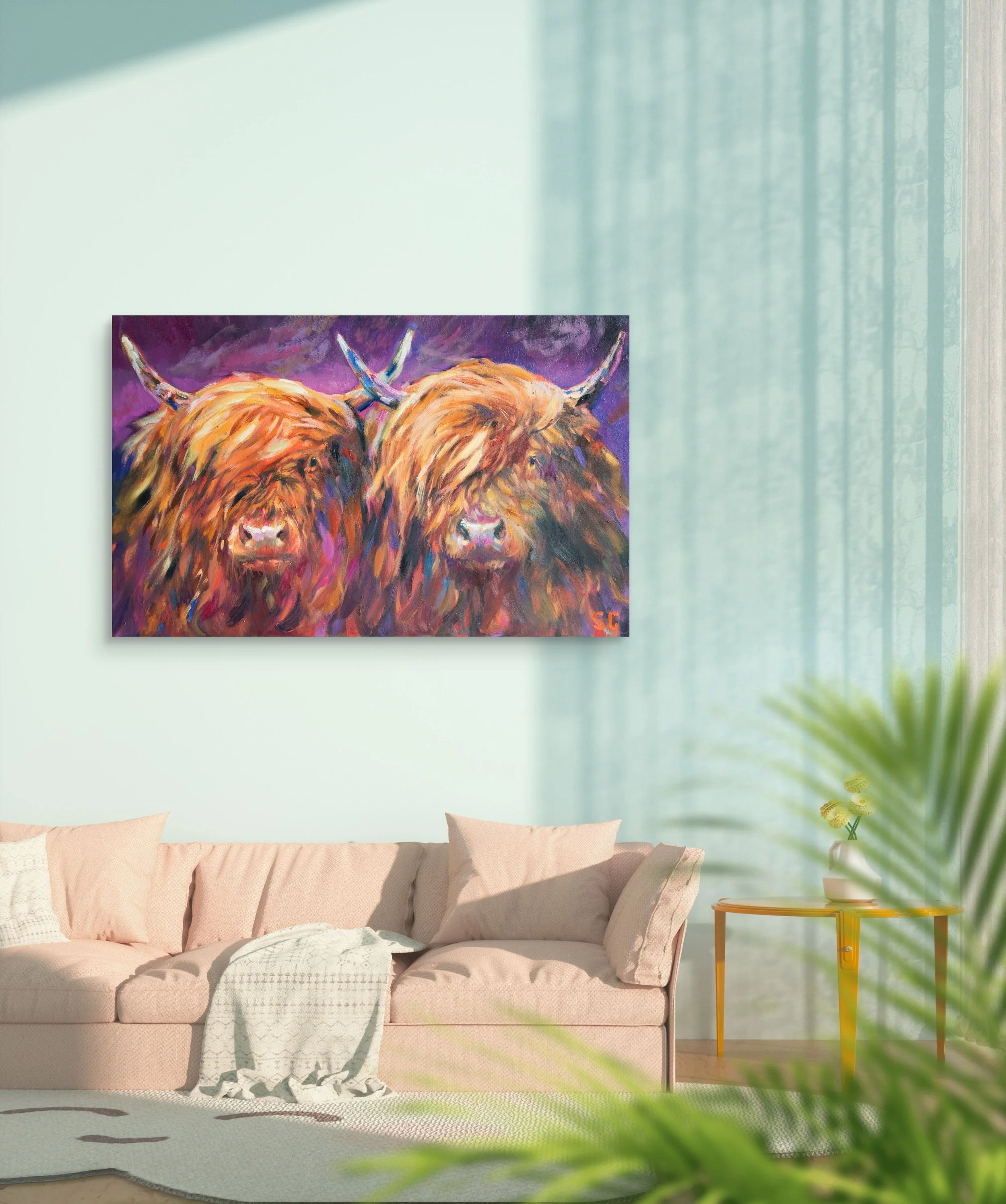
Beginning work on a new painting commission - Highland Cow in bright rainbow colours
Each Highland Cow portrait is a one-of-a-kind, unique oil painting. This little video shows the beginning stage of a new painting, which has been commissioned recently. Im going to film the whole process on this one and give the client the video along with the piece.
Where to buy art supplies?
Are you starting out as an artist and looking to buy art supplies?

I buy most of my paints, canvases, solvents etc. from a company based here in the UK,
It feels like Christmas when my Jacksons’ Art delivery arrives! They hold in stock everything that I need, as well as luxury paints I can only aspire to and beautiful, massive easels that I hanker after. These days I prefer Michael Harding oil paints, and I also love the Williamsburg earth tones. I start with the small 37 or 40ml tubes and then when I find that I am using a lot of a certain colour, I start to save up to get a big 150 or 300ml tube of it next time, as they work out cost-effective.
I paint on stretched canvases and I have tried a few brands but I prefer the Jacksons Premium canvases as they are very good value for money, beautiful canvases, nice and firm to paint on and very good quality. I generally buy them in boxes of 10 which reduces the single canvases price by a worthwhile amount.
The items are always packaged like the crown jewels, and this company offers speedy UK and worldwide delivery options as well as free UK delivery over £40 which is their standard.
I have recently set up an affiliate account with them which means I receive 5% commission from any orders placed through my link to them. This is much appreciated as it helps me to replenish my own painting supplies! If you are new to Jackson they will also give you a 10% discount through this link. Jackson’s Artists Supplies
Above Left: Some recent acquisitions. Permanent Orange, Indigo, and Quinacridone Gold from the range of Michael Harding Oil Paints. Above Right: Detail from an image painted incorporating the new paints.
Oil paint and brush strokes
Painting every day, one often comes up against a newly realised problem or difficulty that needs to be resolved. I say newly realised because it seems that the problem has likely been there all along, unrecognised as such. Ignorance is a kind of bliss, that's true.
This week I have struggled with brush strokes in one of my commission portraits. These are usually tighter and with more detail than my other paintings. Unfortunately this can lead to some overthinking and soul searching during the process. I have decided that it will help me to pay more attention to mark making, and to be deliberate about it sometimes.
I am exploring the possibilities in a variety of marks and shapes, and attempting to create illusion of lines (for instance) rather than the simple directional lines that I naturally go to first. I have found than by breaking up lines and adding movement to them, the effect is more natural and attractive, and the eye still reads the whole as a line.
Here is one example, the tan dachshund's ear just looked flat somehow. The straight down highlight on the edge drew the eye too much and looked wooden. Yet I wanted the left edge of it to be highlighted with the palest bright yellow as the light falls there in the reference photos. So I experimented with a broken line instead of the straight line which works to make the ear sit more naturally
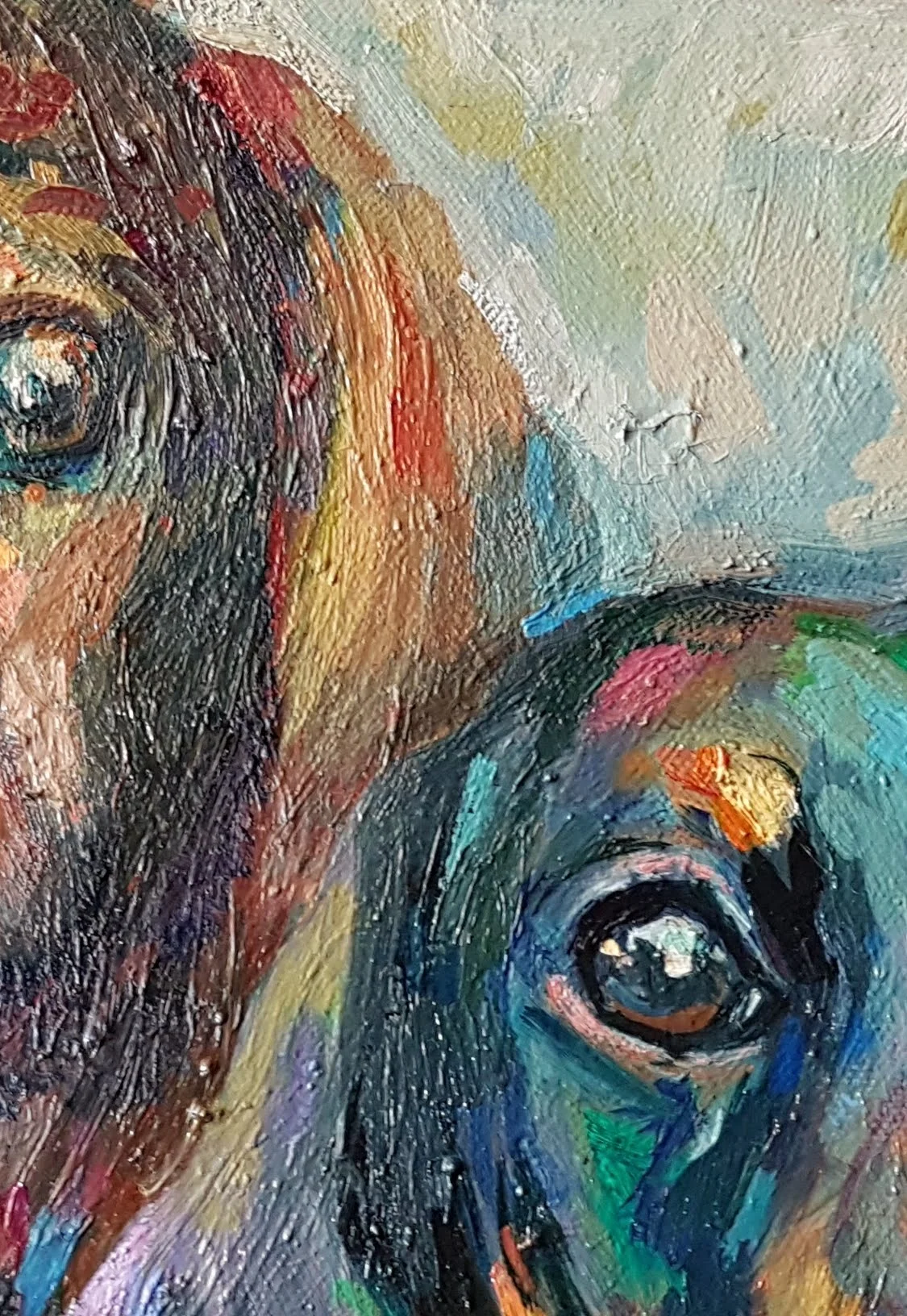

At the same time, I simplified the shape of the ear, removed the extra colours and made the big shape of the ear all one colour (tan). Sometimes as painters we have ideas in our mind as to what things are, and they dont translate or 'read' properly to the general viewer. This was one such case, the extra colours didn't read as an ear so I simplified it back down again. I remember hearing an artist interviewed on the Artists Helping Artists podcast, I wish I could recall her name, but Ill always think back to her words of wisdom.
It was something like ' Don't leave weird, un-recognisable bits in your painting'. I expect that she worded it differently, but it is a great bit of advice all the same.
Painting a horse portrait with lost and found edges.
This painting that I am currently working on is from two pretty good photographs, but I wanted to create a lot more atmosphere and romance in the oil painting than exists in the photos. The horse is a gorgeous aged gentleman, at 36 years still going strong and I want the piece to have a timeless quality.
To this end, I have replaced the stable walls and door and rug in the photo with a background half in deep shadow and half in light. He emerges from the shadows with the light accentuating his profile. (He has such a beautiful facial bone structure that I had to show it to the best advantage in his portrait).
The edges take on new importance in this portrait, meaning that I am trying to create contrast in some important focal areas ( the nasal peak, and the eyes) while playing down contrast in other areas so that they lose themselves in the background.
*Update -here are a couple of photos of the finished portrait.


You can see that I managed to refine the bone structure a great deal. I constantly check and measure proportions throughout the layers of a painting, making adjustments as I go along.
How to paint a black dog

'Flopdown' soft pastel painting 30 x 40cm
Tip 1) Get someone to hold onto him really tight while you do it.
I'm kidding, but the question of how to paint a black dog is one that is often asked. They are tricky to photograph and paint. It can be hard to actually see them in the picture. The best pictures of black dogs make good use of lighting to highlight the form and expression.
I painted this short demo video to share with you. It shows one way to paint a black dog against a dark background, using oil paints. The surface I am painting on is primed fine linen on board 20x30cm
Why not sign up for my artists workshop newsletter and get early access to course dates and online course releases? Sign up below!
Mixing the colours
I dont use a tube of black paint for the colour of the dog and/or background. I do have some useful darks such as Asphaltum, Chromatic Black and Perylene Black, but I usually mix a dark colour from a combination such as Ultramarine and Burnt Sienna, or Magenta and Viridian. I always think a mixed colourful dark looks lively and interesting, as opposed to using too much black squeezed from a tube.
Once my darkest colour is mixed, i put it at one end of my glass palette, and I mix gradients of it in a range of values to use in my painting. I might mix two or three dark shades and then draw them out in this way. I mix white with a really tiny bit of the main colour for my lightest shade, so that it doesn't look too harsh/chalky.
Bear in mind that a photo reference will often bleach out the lightest light colour to appear lighter than you want it. The shadows usually appear darker than in reality. Shadows on photos can also seem flat and one dimensional. Use varied hues in shadows to bring them to life.
What Oil Paint Colors Should Beginners Buy?
Starting your oil painting journey? Not sure which colors you need? Check out this beginner's guide to familiarize yourself with the essential oil paints every beginner should buy.
I firmly believe that we can all learn to draw, paint and handle colour. it is not about 'talent', and it is not about a special secret that only a few select people can be 'born to do'. Creating art is a skill like any other, it just takes practice. Just like learning a foreign language or learning an instrument. No one expects to be fluent at French, or brilliant at Piano after just a couple of lessons. If you really want to learn to paint and draw, it is all there for you.

Mixing colours does take practice. First attempts can yield some surprising results. It can feel annoying. To have what 'ought' to be a beautiful purple turn out to be a big pile of mud.
Check your colours
If colours arent coming out as expected or hoped, take a fresh look at your primary colours. If you only have three, see what you have there. You might have a 'warm' yellow-toned blue (such as cerulean or pthalo blue. Mix with a cool red and you may get a flat brown-grey. What has happened is that your warm (yellowish) blue has yellow tones which are canceling out the purple in the mix. For a true purple, you would need to use two cool shades (cool blue ie french ultramarine x cool red ie Magenta) Neither of those two shades are yellowish, so you will see rich and vibrant purples in the mixture.
Mixing rich purples
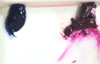
In these three images below I begin with two piles of paint. The red is Scarlet Lake, and the blue is Cerulean Blue. If I was hoping to mix these and get a rich purple I would be disappointed. Mixing the warm red and the warm blue produces a maroon shade.


Compared to these colours below, which are both cool and make some vibrant true purple tones when mixed thoroughly together. ( Although that purple still needed a bit more mixing because we can see a touch of the magenta that has not been blended in on the left of the second photo.)

Mixing bright warm oranges
When trying to make a bright orange, it really needs to be warm colours without too much blue in them. So you could choose a warm yellow and a mid red or warm red (tending toward orange rather than purple) This will give the truest orange.
If you are mixing cool 'bluish' yellow and red, these colours will contain too much of that third colour (blue), which is the complimentary of orange, and will therefore cancel out the rich orange tones.
Greying/toning colours down
That being said, it is also necessary to know how to mix all of the greyed-down shades, so we can use a beautiful variety of colour and values in our paintings. Small amounts of complimentary colour added to a pure colour will grey a colour down or 'knock it back' and make it less intense.
Making Green Less Vivid
If you look at your green paint and it is too vivid for what you need it for, too 'green', try adding a tiny amount of one of your reds. If it is a bright yellowy (warm) lime green try adding a (cool) crimson. If on the other hand your green is (cool)blueish, you can add a small amount of (warm) scarlet. Only add really tiny amounts of your adjustment colour, and mix it well, before you add any more or you really could make mud. It is so surprising how little you need to add in to alter a mix. TINY amounts really.
Warning! colour mixing can be addictive and fun.
By the way, I recommend mixing paints with a palette knife, not a brush. Mixing paints with a brush pushes paint up into the ferrules where it soon ruins the shape. It is also much easier and quicker to wipe a palette knife clean. You can scrape up a good pile of mixed paint and move it about with your palette knife. It is a good idea to mix up a bit more than you think you'll need, particularly if you are going to mix the final colour with white to make tints.
Three dark colours made by mixing with (l to r) Viridian x Magenta, Magenta x Ultramarine and Ultramarine and Scarlet Lake
Select the right colours
While starting out, I would suggest having two of each of the primary colours. A cool and a warm version of each. So you would have a warm blue (tending towards yellow) such as a Cerulean. A cool blue such as an Ultramarine. A warm red such as a Cadmium Red or a Scarlet Lake. A cool red or crimson. A warm yellow and a cool shade of yellow, like a lemon yellow.
And maybe get a few tubes of 'guest' colours as well which are great to add to mixes, such as yellow ochre, burnt sienna, cobalt turquoise. You will need a titanium white or an 'off white' I love Warm white by Gamblin.
Mixing some colours - where to start
The simple thing to remember is that you can only alter a paint colour in 7 ways. You can only make it:
1) Lighter - by adding a little white or other lighter shade
2) Darker - mixing in black is the simplest way, but you can also add another darker colour
3) Brighter - by adding a more intense shade
4) More dull- you can tone intensity down by adding a little of the complimentary colour
5) More yellow
6) More red
7) More blue

Practice is key
I have found the following colour mixing exercise helpful . It involves trying to re create set colours exactly as you see them.
Compare results
Start with the tube of paint you have that is closest to the colour you want to mix. And then add whatever you need to alter it to the new mixture. Keep mixing it with the knife for a while after you think you have finished. This is because if the colour is not properly and completely mixed, you will not get a true reading of the colour at all, and if you try and modify it without a proper reading it will suddenly morph into something quite different than the colour you were expecting. So keep mixing it until there are no little traces of the original colours.
The seven possibilities.
Remember to make it either 1) lighter, 2) darker 3) brighter 4) more dull 5) more yellow 6) redder, or 7) bluer.
That is all you need to do, and only add tiny bits at a time!
Use your new skills
After practice, you will definitely feel a lot more confident mixing colours. You'll find you quickly start to develop an 'eye' for colour and value which you can use straightaway in your next painting!
My Favourite Brands
Here are the links to my favourite brands- these are affiliate links where you will receive 10% off your first order.